Covalence UI | Design System
The Opportunity
CP Chemical wished to enhance workflow efficiency for their employees. At the time, users of the supply chain department had to navigate through multiple applications to complete their tasks. Capgemini was brought in to design a single application to simplify their entire workflow.
This project also ultimately established the groundwork for development of new applications across other departments within CP Chemical. I, with one other designer, was also tasked with creating the design system to be used across all these applications.
My Role
UX Manager
UX/UI Designer
Key Contributions
Built out new design system from scratch
Managed the design workstream
Conducted requirement gathering sessions with stakeholders and users
Translated stakeholder vision into wireframes
Led review sessions for both application-specific designs and design system additions
Onboarded new UX designers onto the project
Client/Project
CP Chemical
Research
Typically, I would start a design system by conducting an audit of visual attributes (such as spacing, color, and typography) and UI elements (such as buttons, cards, badges, and modals). However, since we were building the system from the ground up, we skipped this step and went directly into defining the visual language. The first step in that process was to examine well-established design systems and learn from their design decisions. While we drew inspiration from Google's Material Design and Atlassian's Design System, the client preferred using Fluent UI as the primary resource due to our applications’ tech stack being primarily Microsoft products.
Foundation
In keeping with the industry and the nature of CP Chem's business, we aptly named our new design system Covalence UI.
Design Philosophy
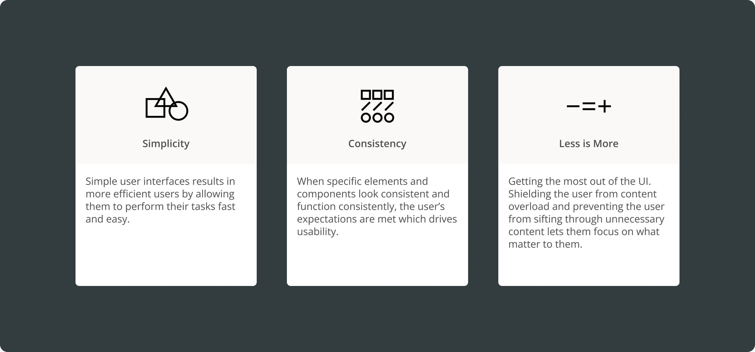
We began by outlining our design values. We wanted our design system to simplify complex workflows. Our objective was to create a system that prioritized legibility, accessibility, and functionality, ensuring it fulfilled the needs of users across all CP Chemical departments.
Important Considerations
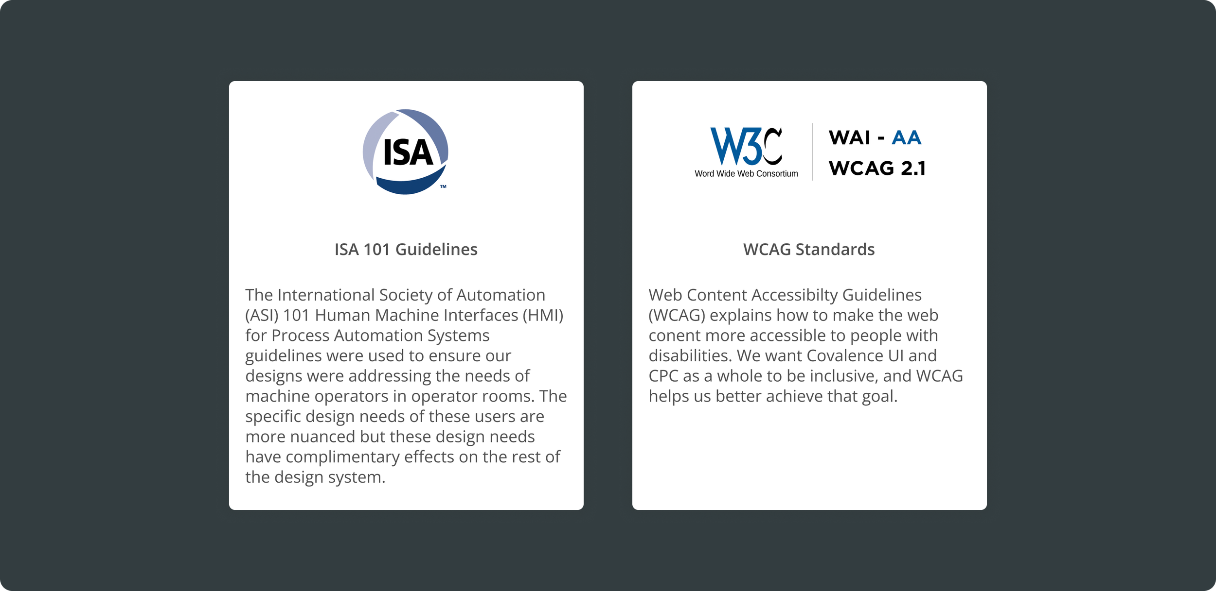
Our applications will serve a diverse group of users throughout CP Chem’s operations, including business executives, field engineers, and control room attendants. To ensure the Covalence UI design system is usable and accessible for everyone, we adopted proven design guidelines tailored to specific user needs. Notably, we leveraged the ISA 101 Human Machine Interfaces (HMI) for Process Automation System guidelines to align our control room designs with industry standards, delivering a consistent and reliable user experience across all areas.
Colors
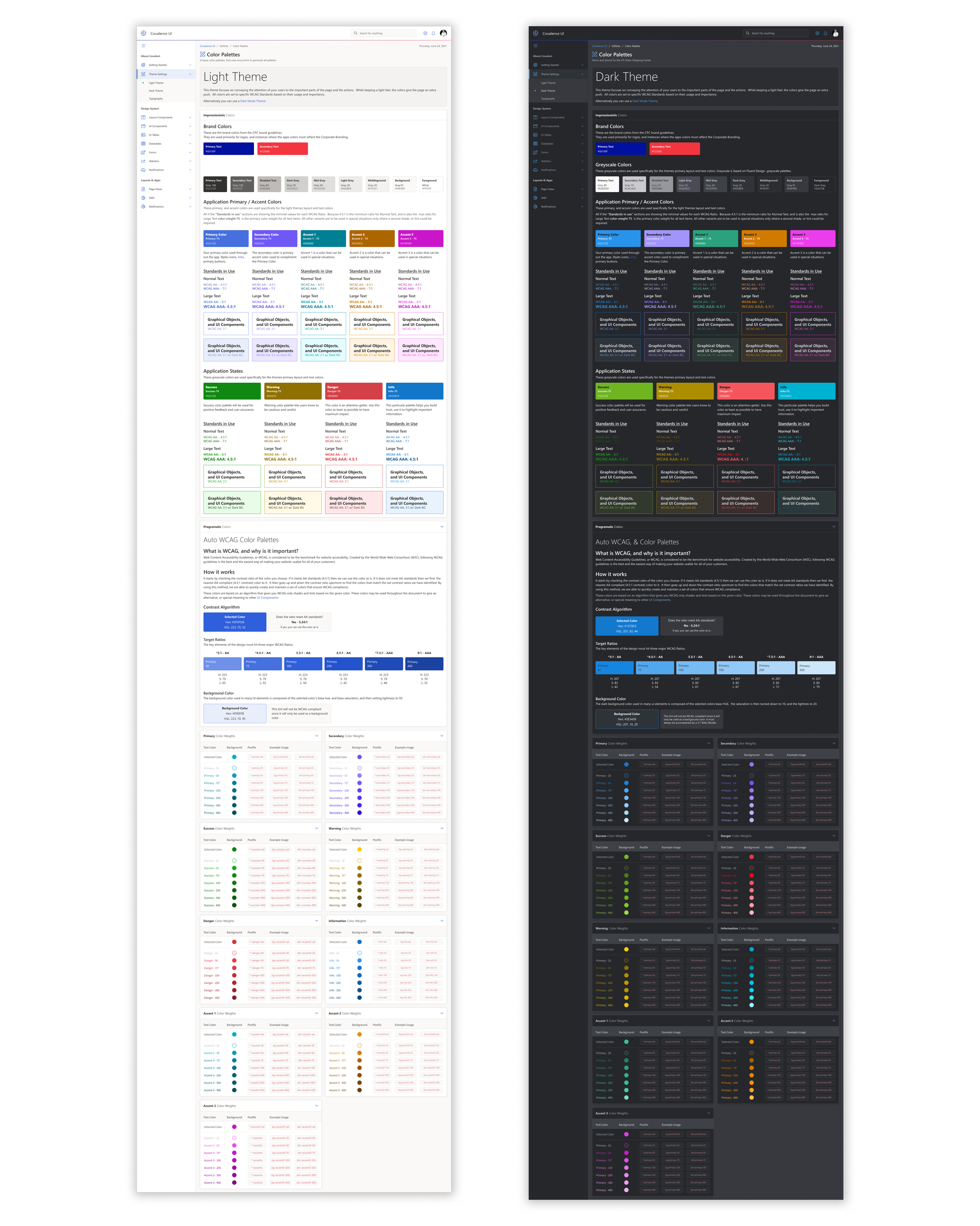
One of our first major tasks was to define the color palette. The brand colors provided were too bold for effective use throughout the design system, so we created usable variations of those colors. As part of this process, the client requested an automated shade and tint generator. This tool would allow us to input any brand color and generate seven shades and tints that comply with WCAG accessibility standards.
While the concept seemed straightforward, developing a set of rules to produce consistent, usable shades and tints proved more complex than anticipated. There are many ways to manipulate colors, and ensuring that the results were coherent and compliant required careful iteration and testing.
Below are several iterations of the color algorithms we developed to create accessible and functional color palettes.
While the color generator does not replace the expertise of a visual designer, it offered the client an efficient solution for generating accessible and cohesive color variations.
Below are examples of the light and dark themes created using our color generator.
Typography
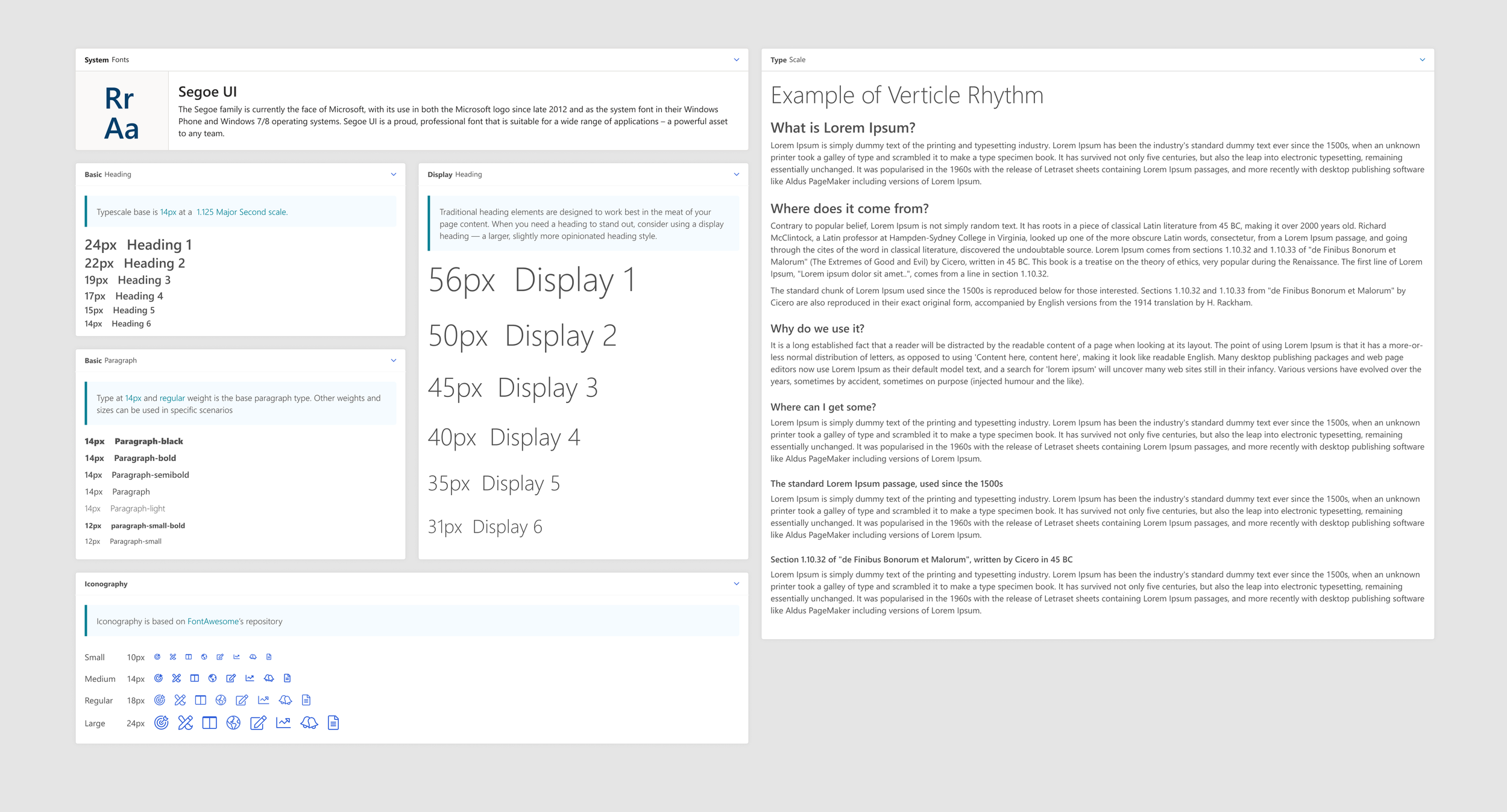
Considering the primarily Microsoft-based tech stack, the client chose to use a standard system font: Segoe UI. Fortunately, Segoe UI’s variety of styles and weights made it versatile enough to establish a clear visual hierarchy and texture. In our typography work, we concentrated on defining a consistent and scalable type system to ensure clarity and usability throughout the design.
Iconography
Icons in Covalence UI serve as essential visual aids, helping users complete tasks efficiently. To align with our design language, we selected the FontAwesome library for its clean, intuitive, and versatile icons. The simplicity of this library ensures seamless integration into our system and its adaptability for smaller screens.
Iteration & Beyond
Components
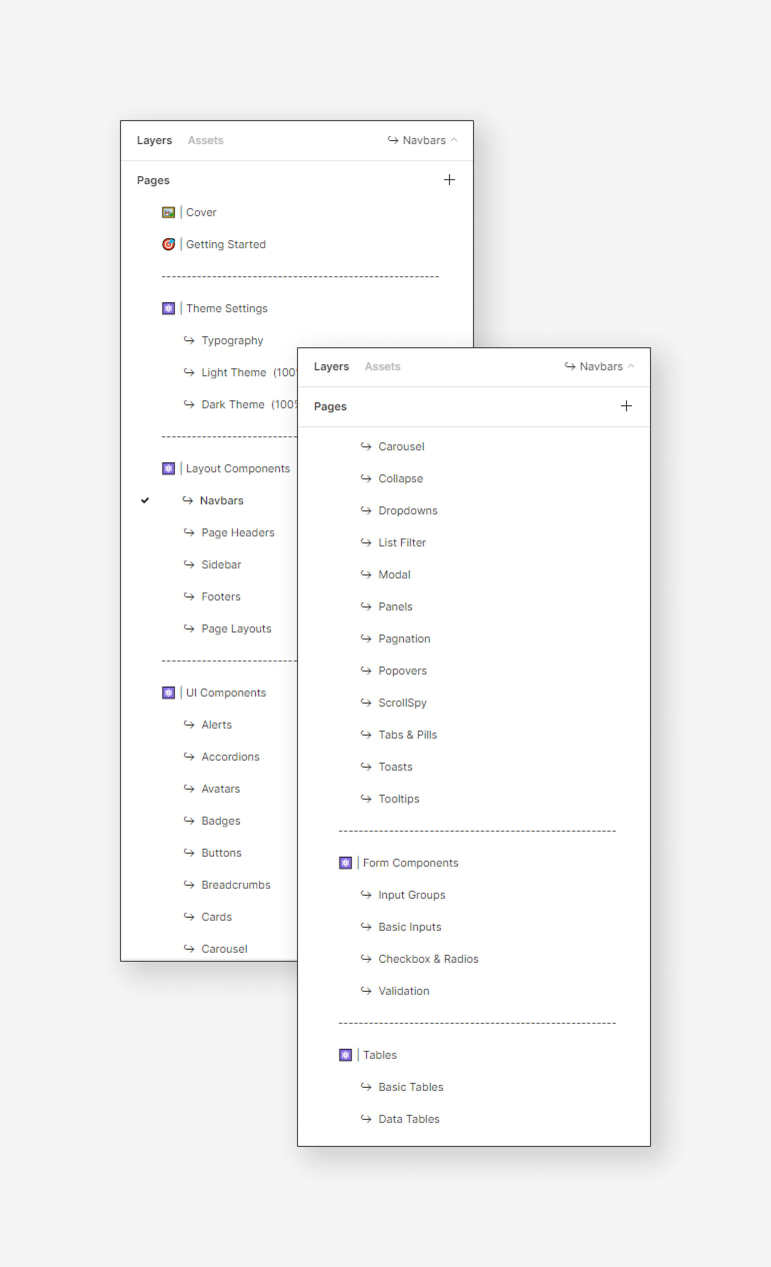
To meet the needs of our applications, I compiled a running list of components. This list included components essential for immediate implementation, those we anticipated needing in the future, and other great ideas we gathered from different design systems.
I organized the components into 5 categories:
Theme Settings - for color and typography
Layout Component - for global layout structures like navbars and panels
UI Components - for the bulk of the components like buttons, alerts, and modals
Form Components - for components like checkboxes and text fields
Table Components - for any components related to tables
Evolution
This case study illustrates only a fraction of the effort required to establish a comprehensive design system. As new applications are onboarded onto the design ecosystem, Covalence UI will keep being updated and expanded. Like any design system, Covalence UI is a dynamic framework that will evolve and mature over time.
Takeaways
Test, iterate, and update continuously. Building a brand-new design system while simultaneously creating the products it supports was a unique challenge. Although managing both efforts at the same time was not ideal, I joined the project at a stage when both needed to begin immediately.
Stay flexible. Even the most experienced teams cannot foresee every change in design or development requirements. Adaptability and a proactive mindset are essential to successfully navigating these challenges.


