
Service Catalog Portal
The Opportunity
The client was seeking to redesign its service catalog portal and upgrade its platform. Users complained that the experience felt cluttered and lacked transparency. They found it difficult to identify which services were available, which were currently in use, and which had been retired. For this project, I:
Conducted user interviews to understand the pain points and opportunities for improvements.
Defined the global design direction of the portal.
Created a set of unique icons that enhanced the visual design while also providing the flexibility to scale.
Role
Lead UX Designer
Team
Myself, Product Manager, Business Analyst
Client/Project
COX
Before
After
Challenges
Some service design needed to be completed. Not all processes were well-documented, requiring extra time to define them.
Getting the stakeholders comfortable with the design thinking process.
Backgroud
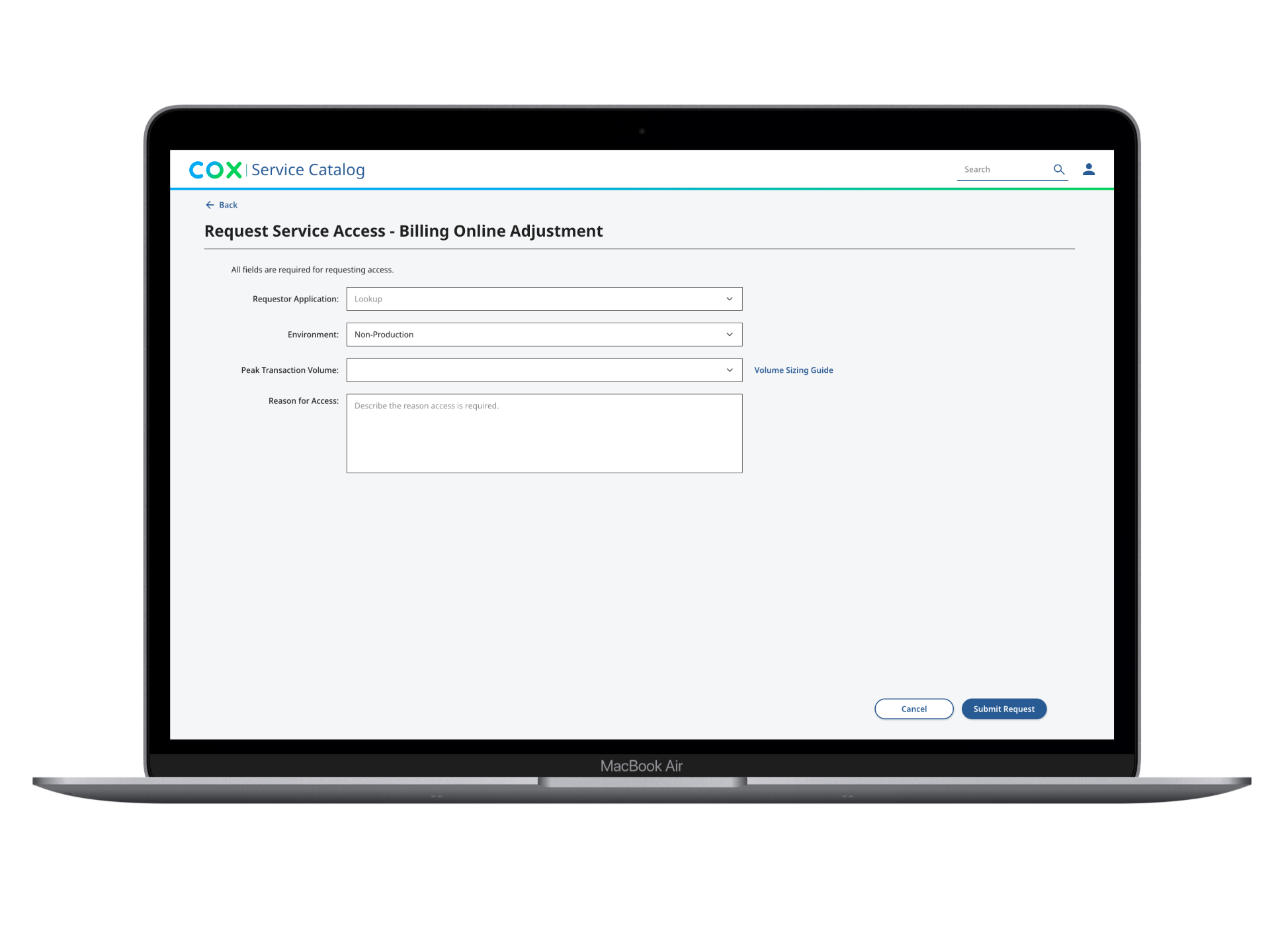
To request a new service, users had to visit an old site, fill out a long, outdated form, and remember to send follow-up emails to track progress. The process was made more difficult by requiring users to know the approver for each service. This required sending multiple emails to different leads. Unsurprisingly, users found this frustrating and a waste of time.
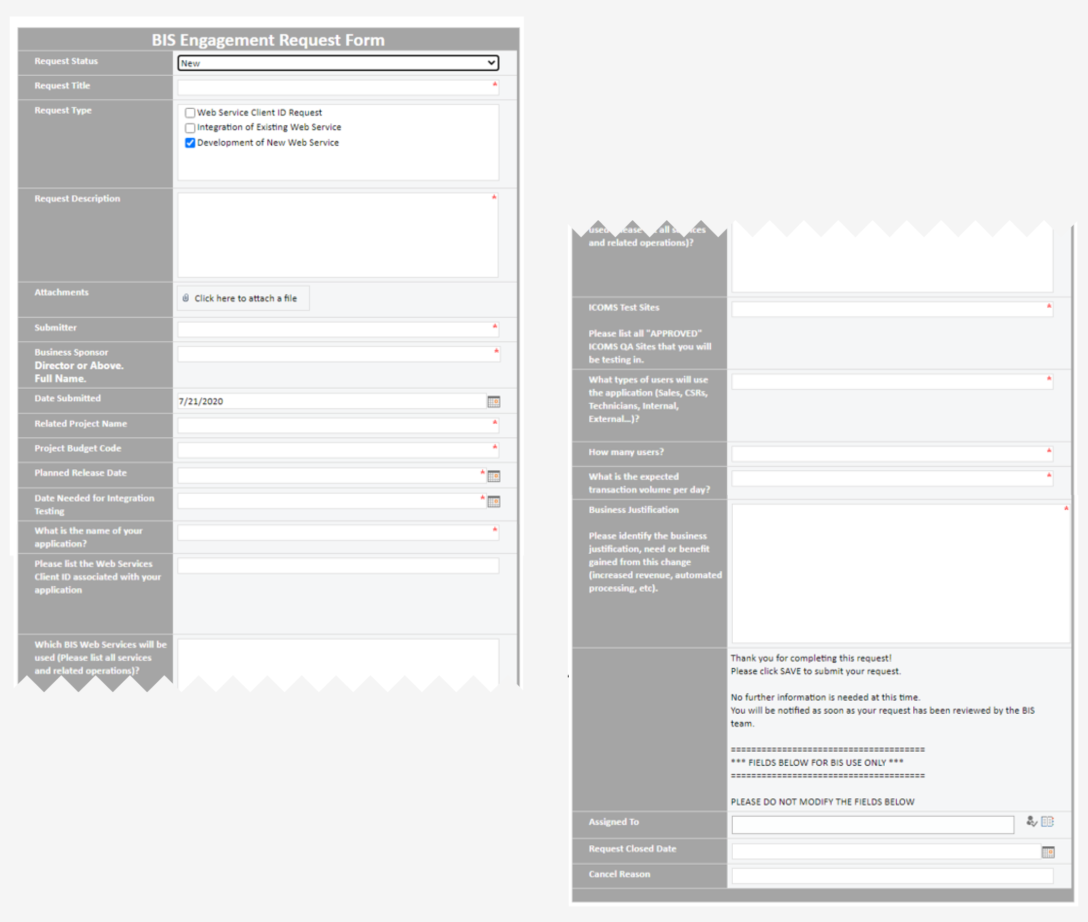
Below is an example of the lengthy form the user had to fill out to make a request. I would eventually drastically shorten it.
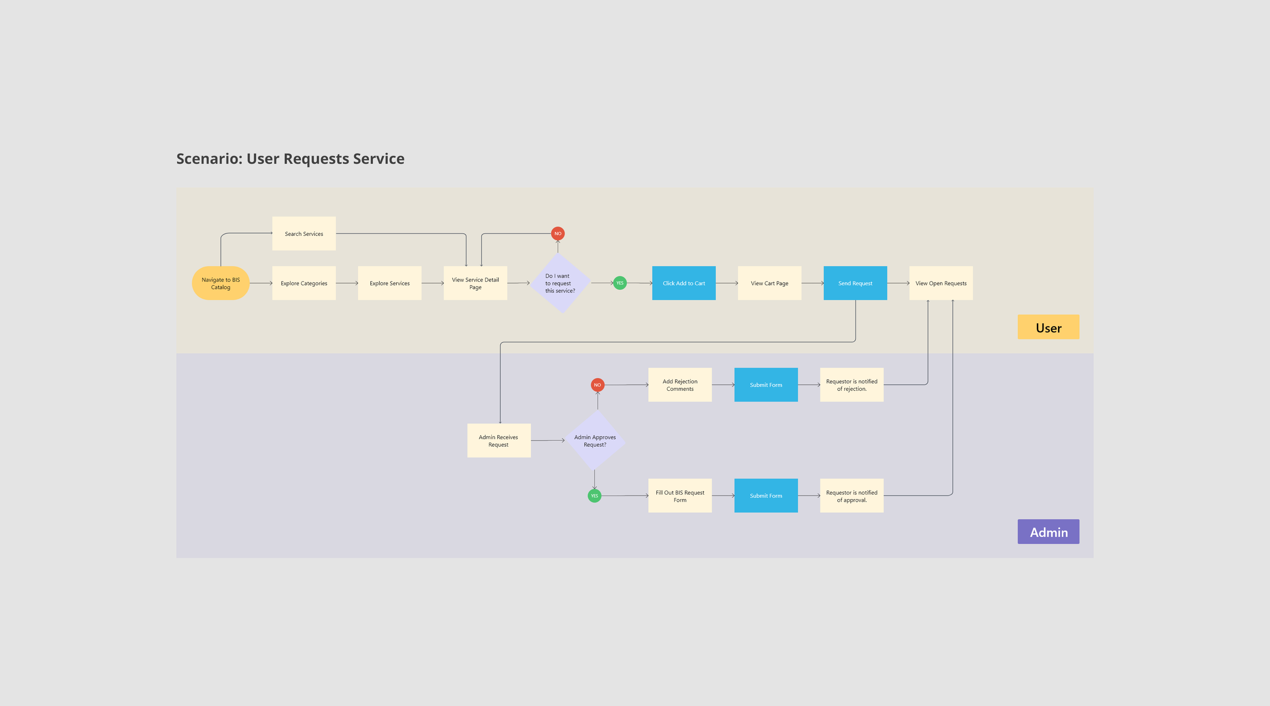
Mapping Out User Flow
The original request-to-approval process was inefficient because it did not fully reside within the service catalog portal. Users had to send emails and fill out Office 365 forms to get a service requested and approved.
This flow illustrates how we streamlined the process and consolidated all external touchpoints into a single flow. It also highlights the connection between the admin’s tasks and the service request.
Explorations
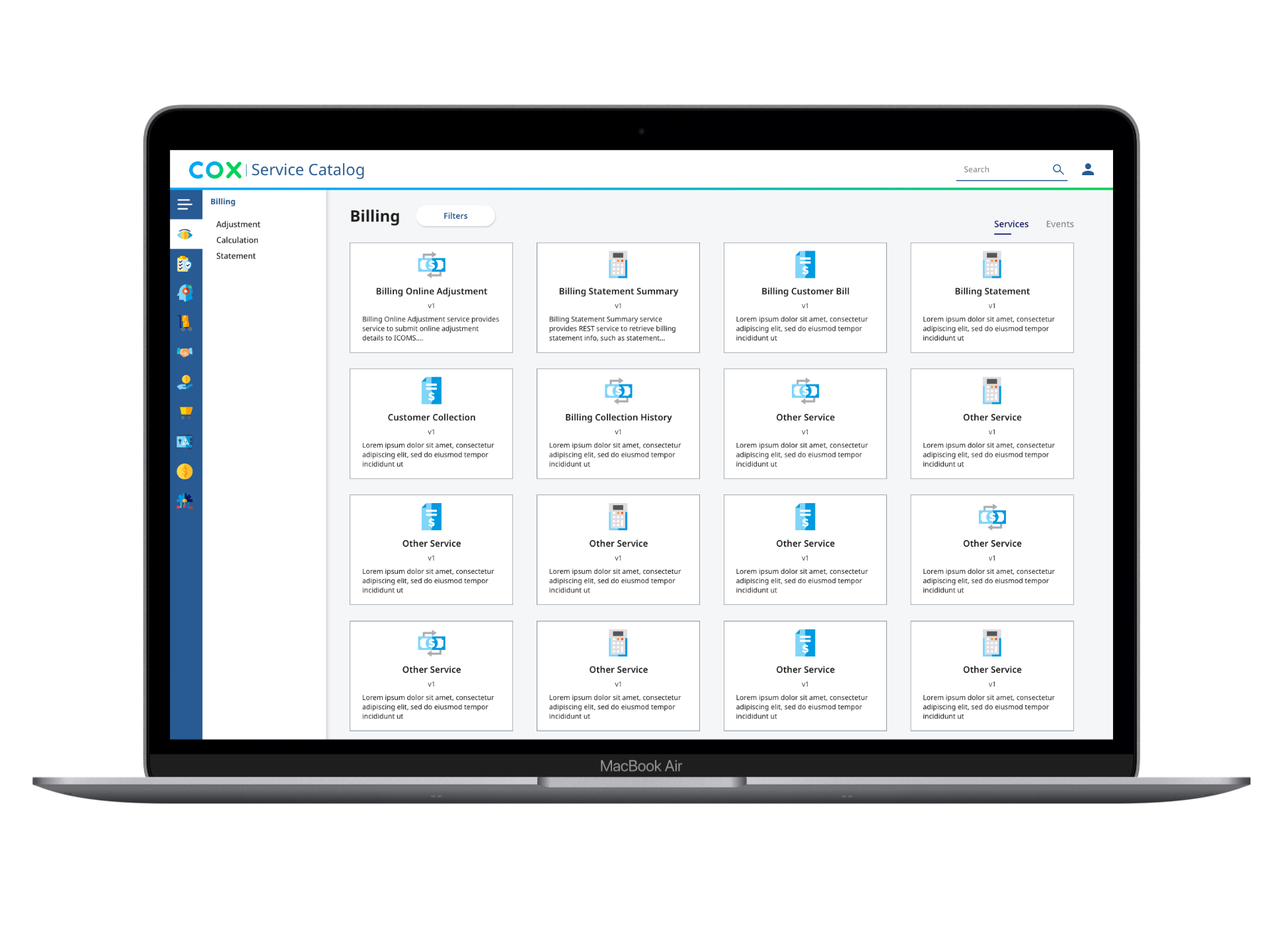
Through interviews and requirement-gathering sessions, it became apparent that users often do not know exactly what services they need. I opted for a design that clearly groups and organizes services to avoid overwhelming the user.
Here are a couple of homepage options I presented. One of the more innovative ideas I proposed was to introduce “Service Starter Packs.” Starter packs would eliminate the need to search for individual services and instead group together services related to a common task. These bundled services are everything the user needs to launch their new application.
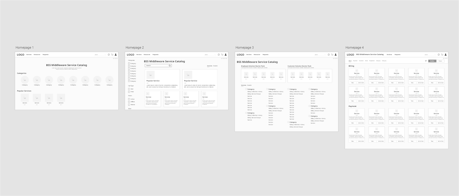
Unfortunately, even though “service start packs" were positively received by stakeholders, they were not implemented due to development constraints.
I went through multiple wireframe iterations, incorporating feedback from stakeholders and end-users. These review sessions allowed me to focus on the information that was truly important to the user.

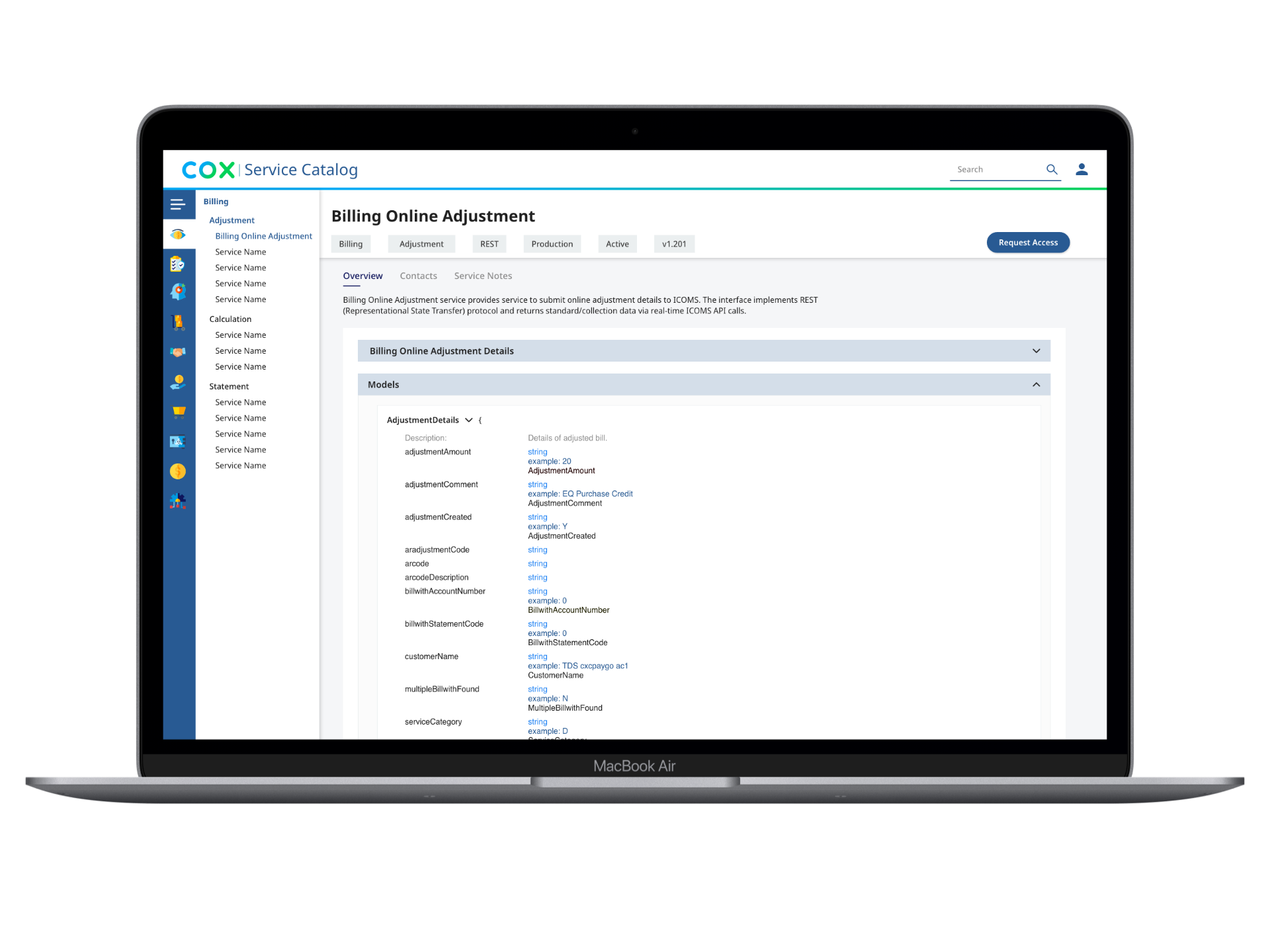
High Fidelity Designs
After defining the overall functionality and layout of the screens, I began layering in the UI. The business had recently updated its branding guidelines and was eager to implement the new style guide on the portal. After several iterations and additions to the style guide, we presented the final mockups.


By asking what information is truly needed, I was able to simplify the service request form to just a few fields.
Admin Screens
In addition to designing the main flow of the portal, I worked on incorporating admin tasks as well. Typical admin tasks include approving requests, modifying service metadata, and removing outdated services from the catalog. Previously, these tasks were handled by sending emails to backend engineers. Our goal was to bring these tasks in-house. By taking the high-level layouts of our main flow and placing the additional functionality in strategic locations, we achieved this. Not only did it provide admins with a consistent experience, but it also reduced development time by leveraging already built layouts and components.
The final solution:
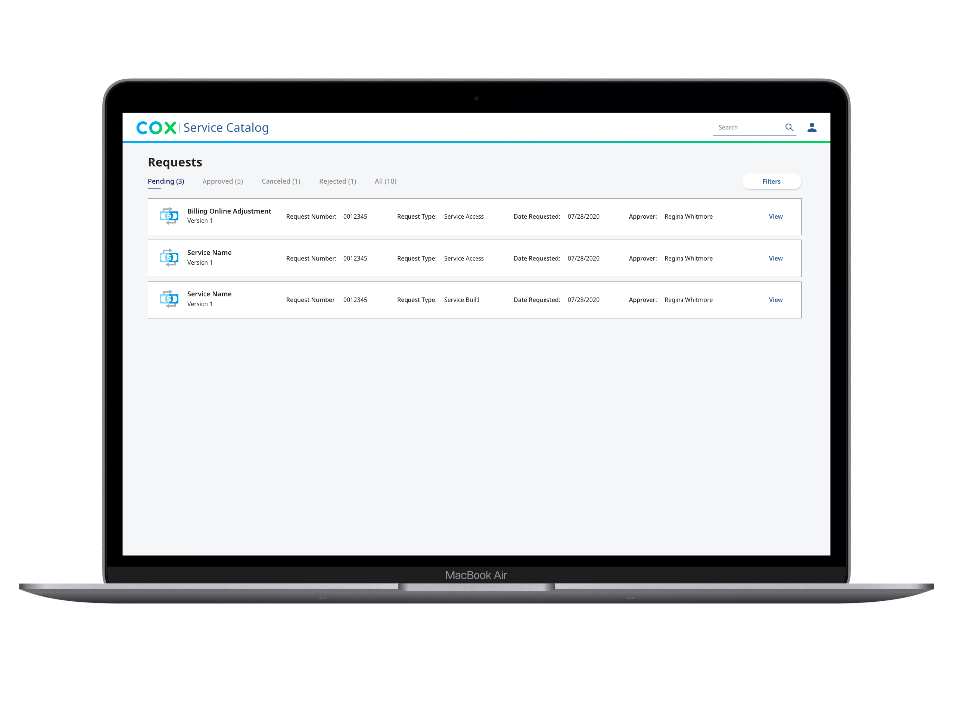
Enables users to explore, request, and manage services all from one platform.
Provides users with an organized way to search for the services they need.
Eliminates the need for requesters to know who the service approver is. The platform automatically directs requests to the appropriate individual.
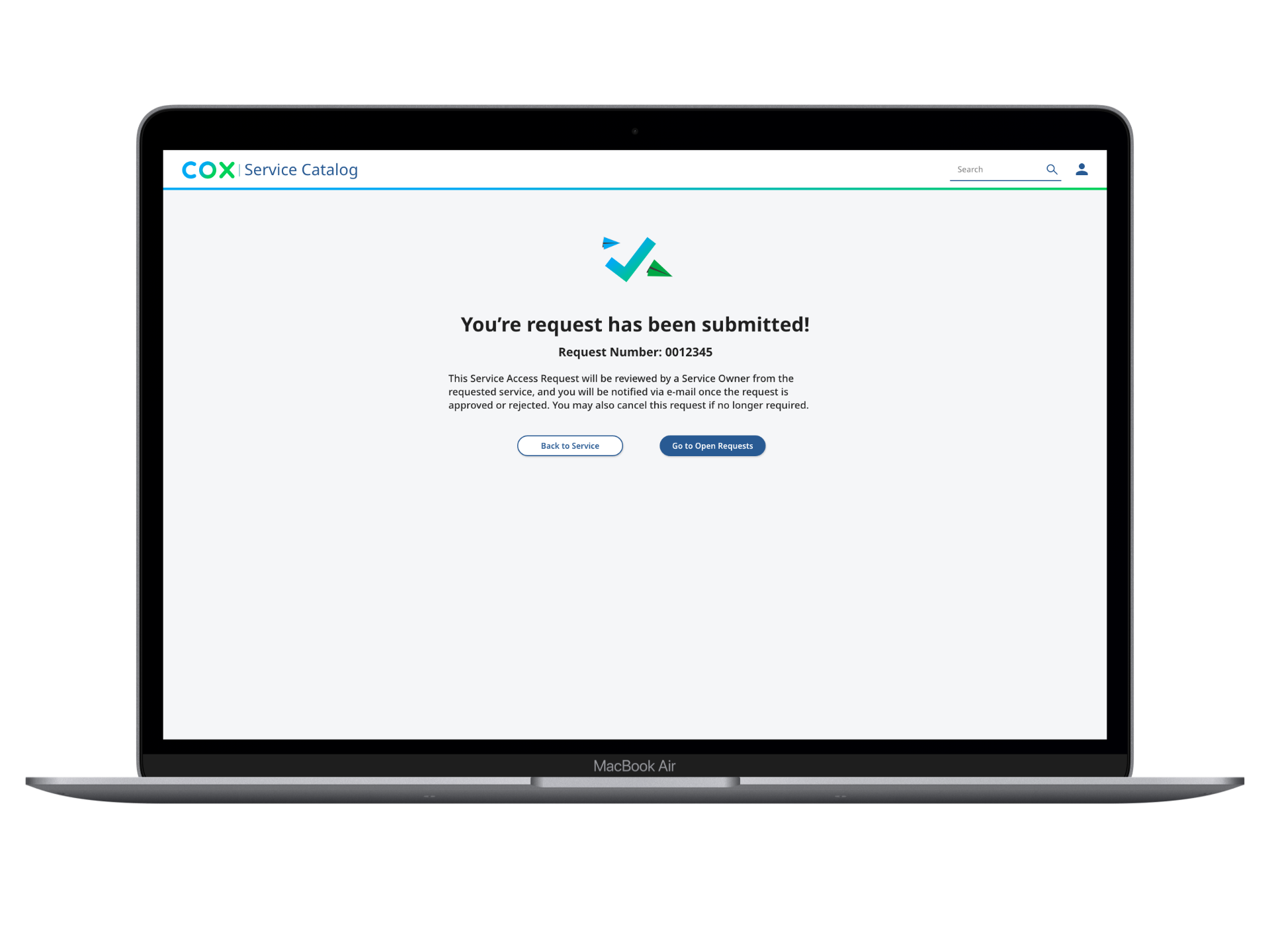
Offers users an easy way to monitor the status of their requests.
Learnings
This project exemplified the importance of user-centered design. By asking, “What information does the user truly need?” I significantly reduced the number of fields and screens required to complete any task. A collaborative rapport with the stakeholders facilitated this process, allowing them to feel comfortable with the design methodology.