Feature Enhancements
Good products are never stagnant.
They should continually evolve alongside their users. In my experience, these enhancements typically stem from valuable user feedback and technological advancements.
Here are a few examples of feature enhancements I've worked on over the past few years.
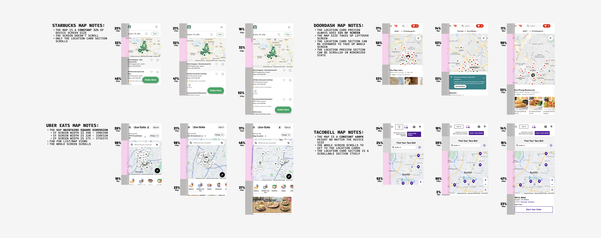
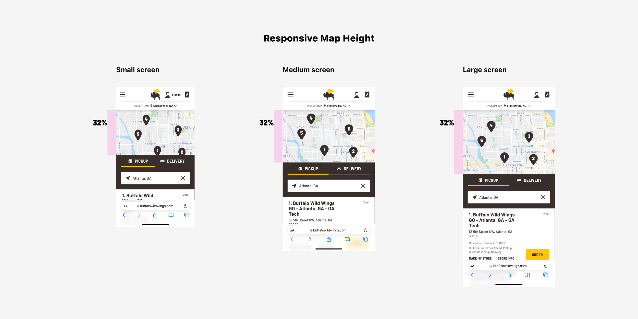
I found that our map height was fixed, regardless of the screen size. By using a responsive size based on screen dimensions, I can ensure that users have a sufficiently large map to interact with while also giving them a preview of what is further down the page.
Conversion had dropped 2%, resulting in an annualized opportunity loss of $6.5M. This update reversed the trend and returned conversion to pre-migration levels.
Issue finding a restaurant
Overview
After a major update that migrated the experience to a new platform, we found that conversion rates were dipping in the order-ahead experience. Diving into data from the analytics team, we found that users were struggling to select a location for ordering. The migration also moved the ‘select a location’ step earlier in the experience, amplifying its effect.
Approach
I found that the map used too much screen space on certain mobile sizes, leaving users unsure how to proceed. I conducted competitor research to determine how other sites approached this challenge. Using the analytics team's data on the most common screen sizes and how users interact with the page, I used a new responsive map size to better guide the users to the next step.
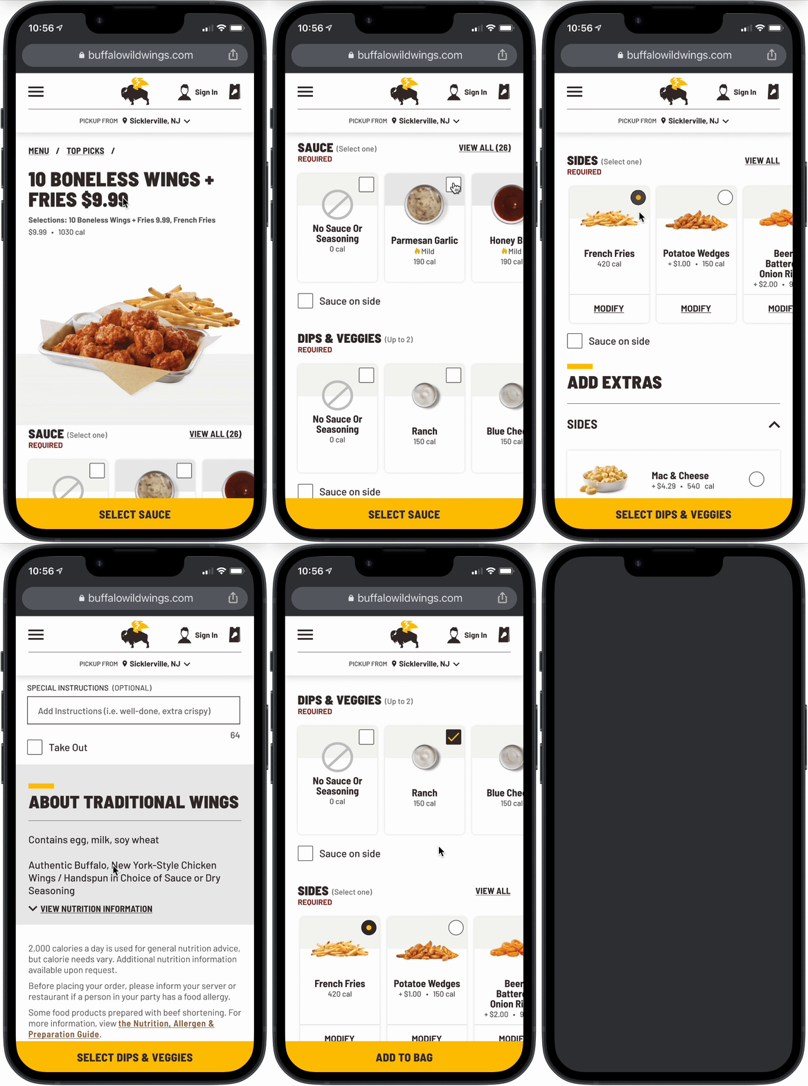
This approach ensures there is always an active button available for the user. Even if the user scrolls past a required section and makes selections out of order, the button will direct the user to the missing required section.
With the redesigned interaction, we observed that users spend less time navigating the order flow. Conversion rates have increased, and user frustration has decreased.
Add to bag drop-off
Overview
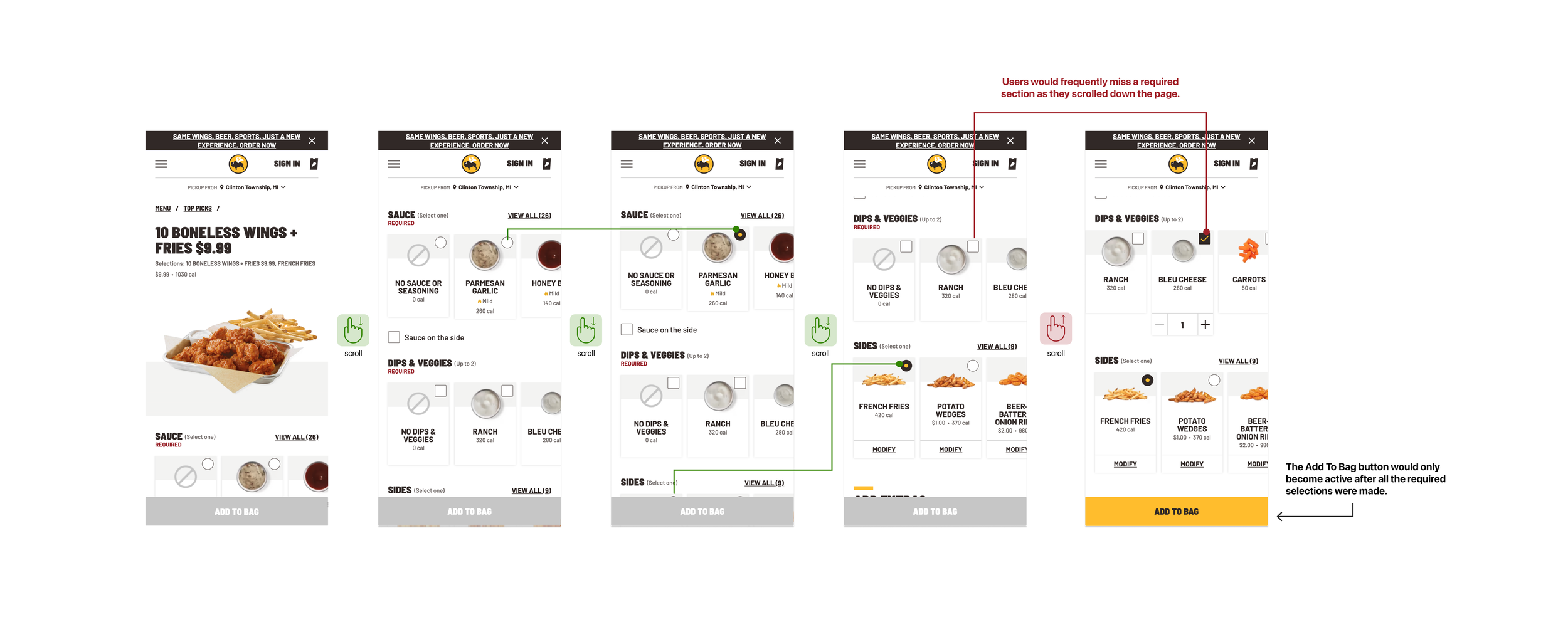
We noticed that users were having trouble adding items to their bag. Upon closer examination, we found that the Wings product details page (PDP) was primarily responsible for the issues. During the same period, the Wings PDP experienced a 7.5% drop in conversion compared to other menu items.
Approach
Unlike other product detail pages, the Wings PDP is unique in that it requires multiple selections before it can be added to the bag. Users would scroll down the page and miss the required selection. Instead of redesigning the page, I opted for an interaction update. To guide users through all the selections, I implemented a dynamic CTA that automatically scrolls them to the correct section.


